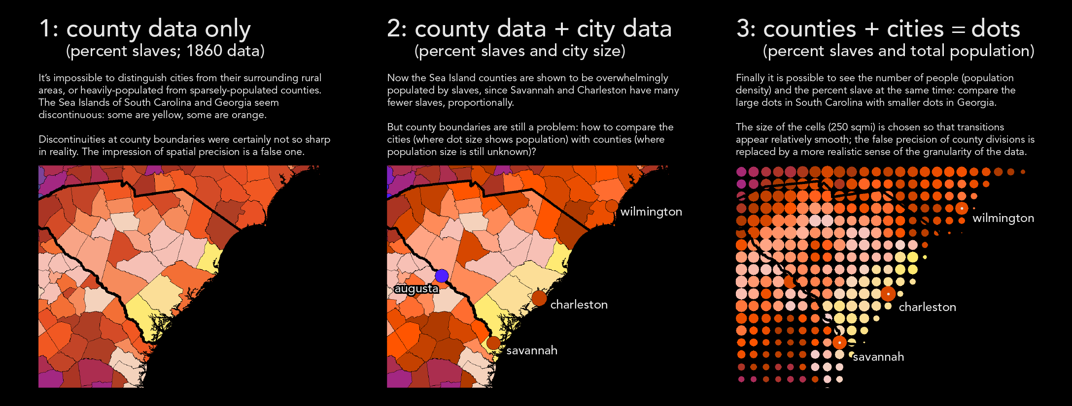
I'm pleased to share a major new project on the history of slavery in the United States. Even after 155 years of mapping slavery, there are still serious shortcomings in most typical maps. My strategy looks for a way around the straightjacket of county-based data and the false impression of spatial precision implied by sharp county boundaries. I incorporate historical data on more than 150 cities and towns; I also use dots instead of counties. Not only does this help to distinguish rural and urban areas (which often had sharply different levels of slavery), but it makes it possible to see population density and the predominance of slavery at the same time. I've posted a graphic explanation of my strategy here.
The project also includes a map of "peak slavery" that shows the maximum number of slaves that ever lived in an area, along with the year of the peak. In the vast majority of the south, slavery was booming right up to the Civil War; only in Delaware, Maryland, and eastern Virginia was slavery in natural decline.